Let me preface this piece with a warning: This is not a broad market update, an earnings season data regurgitation, or a Federal Reserve meeting post-mortem. It’s meant to be a look under the hood at how we manage our model portfolios. As Daniel Ocean said, “If that doesn’t sound like your particular brand of vodka, safe journey (until next post!) and no hard feelings!”
Relative Rotation Graphs, or RRGs, are a tremendous tool that our team uses to assess the relative strength of individual stocks, sectors and asset classes.
As we’ve written before, relative strength is an investing concept that has been heavily researched and is one of the primary refutations of the Efficient Market Hypothesis. If you had to distill relative strength down to a tagline, it’s this: do more of what’s working, and less of what’s not.
But just reading about relative strength can cause glazed eyes in even the steeliest of investment professionals.
With RRGs, we’re able to visually dissect these relationships very quickly, and over any time frame of our choosing.
To construct an RRG, an asset is “comped” (compared) against a benchmark and is classified into one of four categories, or quadrants, based on the relative strength relationship and—this is very important—the momentum of that relationship. Additionally: the further away from the origin (dead center) of the RRG plot, the stronger the relationship (i.e. you might lag by a little or lead by a lot).
As you read on, remember that relative strength, by definition, doesn’t imply anything about absolute investment performance. If stock A goes down 20% in a month and stock B goes down 10%, the latter is said to have positive relative strength, even though absolute performance is negative.
- BLUE: Improving (Negative relative strength, with positive relative strength momentum);
- GREEN: Leading (Positive relative strength, with positive relative strength momentum);
- YELLOW: Weakening (Positive relative strength, with negative relative strength momentum);
- RED: Lagging (Negative relative strength, with negative relative strength momentum);
As data points are accumulated and plotted (daily, weekly, monthly, yearly relative returns), you can see how relationships move over time. Further, these relative strength calculations need not be viewed as static data points. We can also view the trajectory of an asset, and through some basic visual rendering, we can also witness its evolution through time. The time frame selected will greatly impact the visual rendering of the relationship. Meaning, the movement of an asset will look very different using a daily time frame versus a yearly time frame. A day trader would use this tool very differently than a position trader. (Obviously, you would classify Monument into the latter.)
If you look at enough of these interactive plots – especially with individual S&P sectors on shorter (daily) time frames – you will notice that they tend to move in a clockwise manner through the various quadrants. Though there are always exceptions. A meteorological comparison might be the path of thunderstorms in the Midwest. Growing up, I always expected storms in Tulsa to approach us from southwest to northeast. But we always knew that storms might hit us from the northwest, and on a rare occasion, we might get them from a completely unexpected direction (the rare southeast to northwest path).
Bringing it back into investment parlance, you might argue that RRGs visually plot cycles, which are always and everywhere present over multiple time frames. I’ve actually just laid out the base case for why academics and practitioners are so interested in cycle theory: they are pervasive in both nature and in markets. If you really want to get “wonkish,” check out Fibonacci retracement.
In the end, I really enjoy the RRG tool because it’s another way to visually synthesize and compare components of other model portfolios we use at Monument. Specifically, our Flexible Asset Allocation (FAA) strategy, which is heavily reliant on stock-to-bond relative strength, and our Core ETF model, which employs a sector rotation sleeve.
Let’s hit on the Flexible Asset Allocation (FAA) angle first.
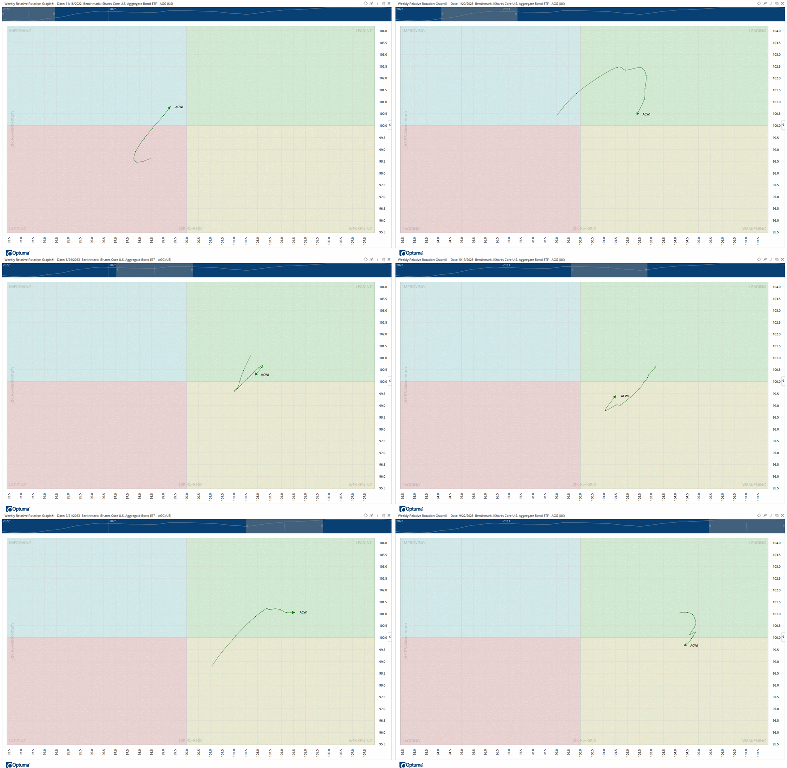
The animation below illustrates the relative strength of global stocks (as represented by the $ACWI ETF) to the bond market (as represented by the $AGG ETF). We’re looking at weekly relative returns, going back over the last year, with the RRG tail representing the last ten data points. You can clearly see global stocks very clearly residing in the red Lagging quadrant as we hovered near the lows in October of 2022, but very decisively changing trajectory near the turn of the year. We’ve spent most of 2023 with stocks residing in the Improving and Leading quadrants, with some early-year zig zagging between the Leading and Weakening zones.
As a reminder, this doesn’t necessarily say anything explicitly about absolute returns, only how stocks are performing in comparison to bonds.
This more-or-less fits with the relative strength data in the Flexible Asset Allocation model, which looks at a longer-term moving average of the stock-to-bond relative strength relationship. The $ACWI RRG plot might currently sit (albeit shallowly) in the Weakening quadrant, but the amount of time spent in the Leading quadrant, as well as the magnitude of the relative strength relationship while residing in that zone, currently mimics our risk-on FAA signal. Where we go for the upcoming October rebalance is anybody’s guess, but unless we see a significant trajectory shift between now and the end of the month (bonds significantly outperforming stocks), I’d wager we stay the course with the current signal.

Now, let’s take a look at Core ETF
Now, let’s view this through the lens of the Core ETF Model, which uses a “dynamic” sector rotation sleeve to complement the low cost “buy-and-hold” core.
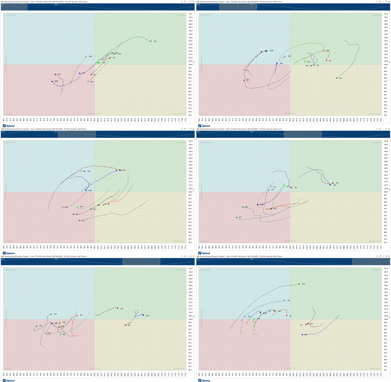
What we’re looking at below are the 11 S&P 500 sectors, compared not to bonds as in the previous example, but to cap-weighted S&P 500. This is where I’d say this piece is relevant for passive investors holding a broad-based S&P 500 fund. You might know the market is up or down, but do you know why? Which pistons are currently moving the car forward or at least keeping it in gear?

Some observations from the sector rotation RRG include the following:
- The extended, demonstrable strength of both Technology ($XLK) and Communications ($XLC), which really picked up steam coincident with the regional banking crisis in February of this year. This is what has caused some to speculate that Tech has become a de facto “flight to safety” sector.
- As we know, Technology is a large component in the cap-weighted S&P 500, so any strength in that sector will magnify the returns of the group.
- The more recent emergence of Energy ($XLE) since July/August, which recently displaced Consumer Staples ($XLP) in our sector rotation sleeve of the Core ETF Model.
- Looking at other individual stock models we manage, the Energy theme has been pervasive, paving the way for some recent entrants into both the Dividend ($PSX, Phillips 66) and Growth ($APA, APA Corp) models.
We hope this post was instructive. If you have any questions, please feel free to reach out. Otherwise, have a wonderful weekend.
~ Erin
*If you’re interested in reading more about RRGs, check out this link.
*We access RRGs through Optuma.
